The Complete Guide to Custom CSS in Squarespace 7.1

If the thought of customizing your Squarespace site with CSS code is intimidating, this article will walk you through everything you need to know about writing custom CSS for Squarespace.
Here’s a summary of what we’ll be covering:
What is CSS?
Where to add custom CSS in Squarespace
Common Squarespace CSS selectors you should know about and how to find them
Finding Squarespace CSS selectors using DevTools
Why is my CSS selector not working? (CSS specificity)
Tips for Writing Clean, Manageable CSS
Use low-specificity CSS selectors
Add helpful comments to your code
Use CSS variables for more manageable code
Nesting CSS rules
Using Media Queries to Write Responsive CSS in Squarespace
Important Things to Verify Before Adding Custom CSS
1. What is CSS?
Cascading Style Sheets (CSS) are used to style web pages. Think of HyperText Markup Language (HTML) as the body of a car, and CSS as the fancy body paint and shiny rims. CSS isn’t just a superficial feature of web design, but actually 83% of people like using attractive and up-to-date sites (2018 consumer UX survey by Clutch) - kind of like how an old-looking car might function just fine, but probably won’t turn any heads.
Let’s consider the 2 link elements below. The first one is a simple HTML link with no styling, and the second one is an HTML link styled with CSS. Which one do you think site visitors are more likely to click?
If you guessed the second one, you’re right. CSS is what enables us to give users a seamless and rewarding user experience when using websites. You might be asking yourself, “Isn’t a Squarespace template good enough without any extra styling with CSS?” While Squarespace already does a pretty great job of providing a user-friendly way of creating beautiful websites without code, no web builder platform is perfect and you’ll more than likely come across something you wish you could change, whether it’s hiding something on mobile devices, changing the hover effect of a button, or changing how grid layouts display on certain screen widths.
Here is a helpful diagram explaining CSS syntax:

CSS can improve your site, but it can also hurt your site’s user experience if you’re not careful. You might enjoy reading my article Is Your Squarespace Custom CSS Hurting or Helping Your Site? if you need help deciding if your custom CSS is doing its job well.
2. Where to Add Custom CSS
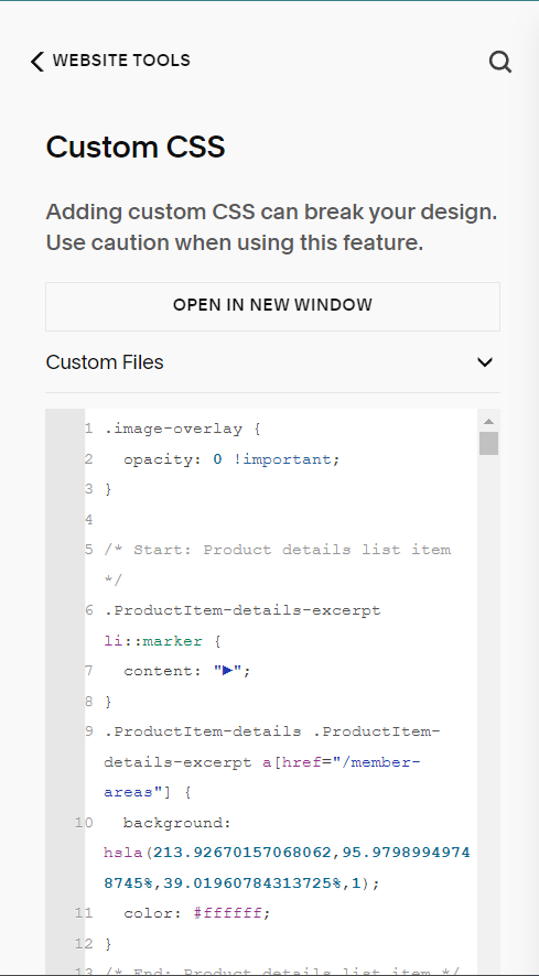
There is more than one way to add custom CSS code in Squarespace, but the best and most common place to add it is in the Custom CSS editor.
You can access the Custom CSS editor by navigating to Website> Website Tools > Custom CSS. See the picture below for reference.
3. Some Common Squarespace CSS Selectors You Should Know About and How to Find Them
There are thousands of different CSS selectors that Squarespace gives to each HTML element, including class names, IDs, and other types of attributes, but here are the most commonly asked-about selectors that you should know about:
data-section-id attribute: This is an attribute given to each page section in Squarespace. You will need to use the CSS attribute selector to find it like so: [data-section-id="sectionidhere"]
Finding page sections based on color theme in 7.1: Squarespace offers 5 different colors in your site’s color palette. In addition to customizing the color of different elements using the Squarespace design editor, you can target specific elements inside of a specific color-themed page section using the color theme CSS selectors attached to each page section.
Block ID selectors: The block ID selector is an ID given to each Squarespace block (image blocks, accordion blocks, gallery blocks, etc.). It looks like the typical ID selector but it will be in a specific format like so: #block-yui_3_17_2_1_1690691237911_5006
Typical class and ID selectors: Every other element in Squarespace including the ones mentioned above will have multiple other class names and attributes that you can utilize to write CSS.

Example of the data-section-id attribute that is given to each page section in Squarespace 7.1.

Example of an ID selector.

Example of a class selector. This one has 2 classes.

Example of 2 types of page section color theme selectors, including data-section-theme attribute and the class name that refers to the page theme.
4. Tips for Writing Clean, Manageable CSS
Here are some of my most helpful tips that will help your custom CSS panel stay clean and easy-to-manage.
Use Low Specificity CSS Selectors for Manageable Code
Making CSS selectors as simple as possible can speed up your website’s load time, as well as make your CSS way easier to read and edit.
Because the computing and compiling time of modern browsers are so fast nowadays, speed is much less of a concern when writing CSS; however, low specificity selectors have a much greater impact on code readability (how easy it is to read the code) and maintainability (how easy it is to edit and maintain the code), so it’s still an important topic to cover.
What’s wrong with CSS selectors that are too specific?
CSS selectors that are too specific can cause sloppy code that is hard to read and edit properly, and it can cause problems when you try to write more code in the future. When you use highly specific selectors all the time, it can creep up over time causing future overrides to not work. Ultimately, you end up fighting against your own code because there is not enough room for more specific CSS selectors.
Now if you have some experience with the !important tag, which basically overrides everything, you might be thinking, “I can just throw an !important tag here and be done with it!” WRONG! If you keep using this as a strategy for overriding previous CSS rules, you’ll eventually get to a point where you can’t write any more code to style a specific element without getting even more specific with your code, at which point you can see how the sloppiness builds up over time.
If you need more practice figuring out how to go about writing low-specificity CSS selectors in Squarespace, I go into full detail about this very topic among other Squarespace CSS-related topics in The Functional CSS Course.
How to write simple CSS selectors
Low specificity selectors refer to CSS selectors that are as simple as possible. This means using minimal descendant selectors (select elements nested within an element) and chained selectors (select elements with multiple attributes or classes) unless absolutely necessary.
Sometimes, using really specific CSS selectors is unavoidable, because since Squarespace already has a lot of pre-built CSS style sheets that use !important rules and other highly specific CSS selectors, we will sometimes be forced to use highly specific selectors. Still, a good rule of thumb is to make your selectors as simple as possible, and only use the !important rule when you absolutely need to.
To make your selectors as simple as possible, I recommend using Chrome DevTools to view what selector is currently being given precedence to the CSS property you’re hoping to override, and then write a selector in your Custom CSS editor that matches that specificity exactly. This way, you will be sure to override the property.
For more details on CSS specificity, check out my blog post A Guide to CSS Specificity and Best Practices - Squarespace 7.1.
Add Helpful Comments to Your Code
Adding comments to your code editor is one of the best ways of maintaining a clean code editor. Comments make it very clear what each block of code does and why it is important so that whoever else is reading or editing the code has a better idea of how to modify it.
There are two ways to add comments to CSS code: multi-line comments and single-line comments, but because multi-line comments are notorious for cluttering up CSS, I will only be showing you how to use single-line comments. I would recommend using single-line comments as starting and ending tags of a block of code - this way, you know exactly where a block of code starts and where it ends. Here is what that looks like in action:
Single Line Comments
//Start: Make paragraphs blue
p {
  color: blue;
}
//End: Make paragraphs blue
To give you a better idea of the power of well-written comments, let’s look at the following examples. The image on the top is an example of the Custom CSS editor with comments written as start and end tags, and the image on the bottom shows the CSS editor with no comments. You can see how much easier it is to know which blocks of code do what in the top image. This gives you the ability to edit and delete code more confidently.

Custom CSS editor with well-written comments.

Custom CSS Editor with no comments.
Use CSS Variables for More Manageable Code
CSS variables allow you to declare CSS properties for static CSS rules. For instance, If you want to make all H1’s a certain color, you could declare a variable for heading 1 color; this allows you to use the variable in multiple CSS rules without the redundancy of using the same color multiple times, and it also makes it much easier to make changes to the code.
See the example code snippets below to see this in action.
Declaring and Using CSS Variables
@heading1Color: blue;
h1 {
  color: @heading1Color;
}
Here is a series of CSS variables used in the Mega Menu Plugin for Squarespace 7.1
Nesting CSS Rules
Squarespace gives us the option to nest CSS rules that are inside of the same parent HTML element. Nesting CSS rules allows us to cut down the amount of redundant selectors we would otherwise have to use, resulting in a much cleaner and more maintainable CSS backend.
Consider the following examples. In the first image, we’ve defined a 3 separate CSS rules for elements that are all within the same parent element. The second image achieves the exact same thing, but instead of having to define the parent element selector 3 separate times, we just define it one time, which condenses the amount of code in our editor.

Redundant parent selectors that clutter up code.

Nesting selectors and grouping selectors which is more maintainable and easier to read.
5. Using Media Queries to Write Responsive CSS in Squarespace
Media queries allow us to define different CSS rules for different media types using screen sizes. For example, we can have one set of style rules for desktop computer screens, one for mobile devices, and one for tablet devices.
Media queries can be used to check many things, such as:
width and height of the viewport
width and height of the device
orientation (is the tablet/phone in landscape or portrait mode?)
resolution
Media Query Syntax
The basic syntax of a media query is as follows:
@media mediatype and (expressions) {
<CSS CODE GOES HERE>;
}
We must start with the term “@media”, followed by the media type which in our case will be “screen”, followed by the conditional word “and”, and an expression inside of the parentheses. Then, we will use opening and closing curly brackets {}, inside of which will go our CSS rules for that particular screen size.
You can also include multiple expressions using the “and” keyword, or by separating them with commas. Doing this allows us to write conditional logic using media queries. Conditional logic is how we can apply CSS only when certain conditions are met. For an in-depth look at media queries including how to use conditional logic, you might consider enrolling in The Functional CSS Course for Squarespace, where I will walk you through how to write different types of media queries, plus so much more.
Media Query Expressions
Here are all of the expressions that you’ll need to know for media queries:
min-width => Specifies the minimum width of the screen.
max-width => Specifies the maximum width of the screen.
min-height => Specifies the minimum height of the screen.
max-height => Specifies the maximum height of the screen.
orientation => Specifies landscape or portrait mode. Landscape means the width is larger than the height, and portrait means height is larger than width
Example of Media Queries
This makes all <h1> elements aligned to the left on screen sizes smaller than 769px.
@media screen and (max-width: 769px) {
   h1 {
      text-align: left;
   }
}
This makes all <h1> elements blue on screen sizes larger than 769px.
@media screen and (min-width: 769px) {
   h1 {
      color: blue;
   }
}
This defines a range of 769px - 900px; it makes all <p> elements have margin-bottom of 0px on screen sizes between 769px and 900px.
@media screen and (min-width: 769px) and (max-width: 900px) {
   h1 {
      color: blue;
   }
}
This defines multiple different media queries that are evaluated on their own (unlike using the “and” logic, which checks to make sure all conditions are met). This is known as the “or” operator, and is the basically an easier and cleaner way of defining multiple different media queries. This query makes all <p> elements a font-size of 1.5em if the screen size is less than 500px, or if the height is less than 800px.
@media screen and (max-width: 500px), (max-height: 800px) {
   h1 {
      color: blue;
   }
}
Important Screen Breakpoints in Squarespace
max-width: 769px is the point where the mobile view of a Squarespace site will show. This includes tablet views that are in portrait orientation.
max-width: 800px is the point where the header on Squarespace sites will display the mobile view.
To target tablet views, I typically use the breakpoint max-width: 1280px, since that is the largest tablet screen size in landscape orientation.
6. Important Things to Verify Before Adding Custom CSS
Make sure the thing you’re trying to accomplish can’t already be done in Squarespace without custom CSS.
Squarespace might already have a way of doing what you’re trying to do with CSS, and if that’s the case, it’s better to use the native functionality.
For instance, if you’re trying to modify the font size of a text element using CSS, make sure there’s not a way of setting that font size in either the Design panel, or in the block editor. Otherwise, you might come across it later on after you’ve added the CSS, and when you try to customize using Squarespace’s mechanism, you’ll be confused as to why it’s not working.
Make sure your CSS code snippet is not messing up an alternate layout in Squarespace.
Certain Squarespace blocks and collection pages have CSS selectors that differ based on the layout being used.
For instance, Squarespace image blocks have 6 different layouts you can use in the Classic Editor: Inline, Poster, Card, Overlap, Collage, and Stack. Some of the CSS selectors for each of these are different and some are the same, so if you write some CSS that you meant to apply to Card image blocks, it might not look as expected on the other image block layouts.
You’ll want to make sure your CSS is not messing up blocks or collection pages that use different layouts by using the appropriate selectors. If you need some extra help with using the right selectors, check out the Squarespace 7.1 CSS Selector Guide & Cheatsheet, which provides a detailed breakdown of these different selectors.
Make sure your CSS modifications look good on all screen sizes.
Your CSS might look OK on desktop screens, but depending on the type of modification, it might appear congested, too big, too small, or not optimized for vertical layouts on smaller devices like tablets or mobile phones.
Make sure to verify that your custom CSS looks good on every screen size. If it doesn’t, you can use media queries to fix this problem.
Related Blog Posts:
A Guide to CSS Specificity and Best Practices - Squarespace 7.1
Is Your Squarespace Custom CSS Hurting or Helping Your Site?
8 Common Mistakes to Avoid When Writing Custom CSS in Squarespace
7 Proven Ways to Clean Up and Speed Up Squarespace Custom Code
3 Ways to Use Code Blocks in Squarespace 7.1 (with Examples)