Analyzing 6 Comparison Table Designs
A comparison table is a versatile tool that provides users with a comprehensive way of comparing different items or services with low interaction cost and low cognitive load. It typically has the products or services being compared as table columns, and the attributes included in each product or service as the table rows. This has proven to be a timeless way of easily comparing a small number of offerings in web design.
In this article, will closely analyze 6 different comparison table designs. We’ll discuss commonalities among each, and what design patterns are unique to each that make them work for different purposes.
1. ELXR
Elxr is a platform that grows businesses, monetizes content, manages clients, and generates recurring revenue for life for health and wellness professionals. They use a comparison table to show why they are a better choice for their competitors. This table design is a very basic one, but it still a comprehensive way of comparing ELXR to other brands.
It includes the basic elements of a comparison table, including the products being compared as the column headers across the top of the table, the column headers containing the product name, the features and attributes by which the products are being compared as the table body row headers (the first column), and indicator icons or text as the table data which signifies if an attribute is included in a corresponding product.
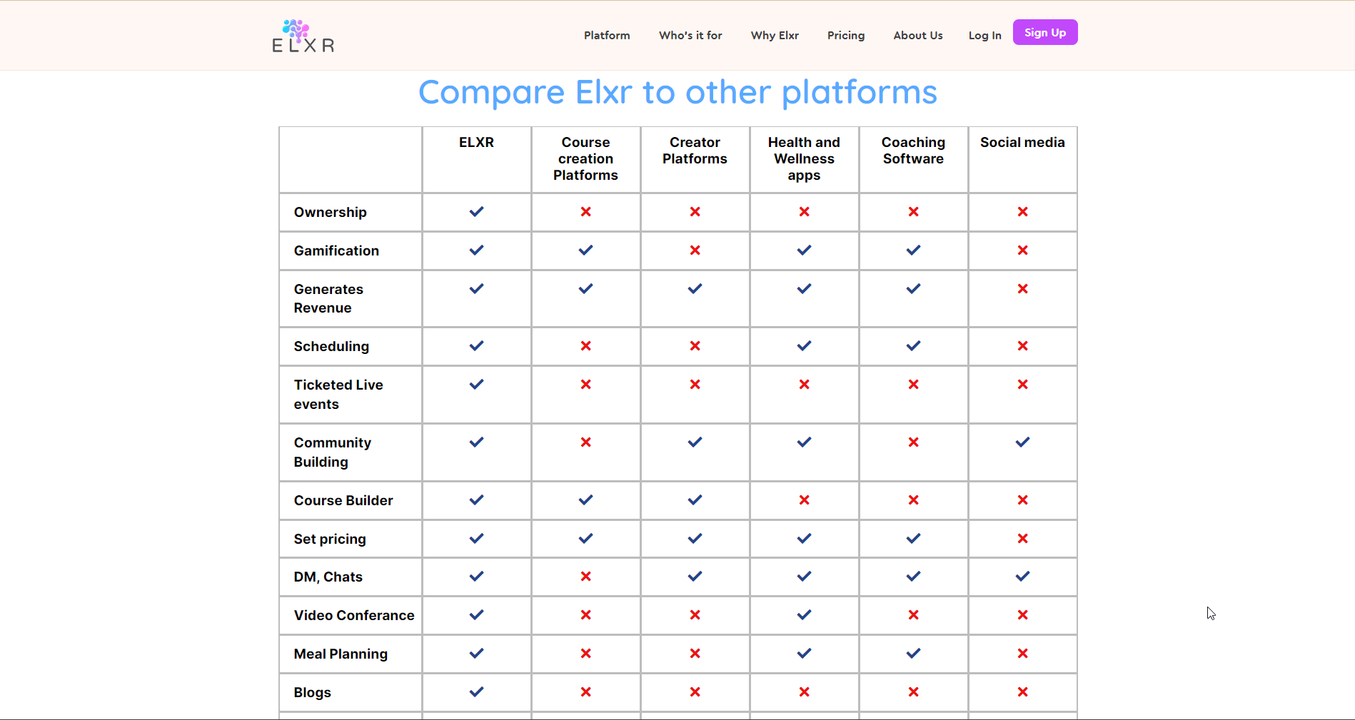
This table was created using the Comparison Table Generator.
2. JOBBER
Jobber is a cloud-based field service management software solution that allows small and midsize service businesses to manage field staff, provide customer support, and expand business operations either through a mobile app or a desktop dashboard. They utilize a product comparison table to differentiate between their Core, Connect, and Grow pricing plans.
It includes the basic elements of a comparison table, including the products being compared as the column headers across the top of the table, the column headers containing the product name, the features and attributes by which the products are being compared as the table body row headers (the first column), and indicator icons or text as the table data which signifies if an attribute is included in a corresponding product.
In addition to the basic elements, they include feature group rows to categorize the different features for a more comprehensive user experience. They have also repeated the 3 different column headers representing the different product versions with each feature group, which is an acceptable alternative to making the headers stick to the top of the page on scroll - this allows the user to keep the context of the table data while scrolling through the table.
This table is dynamic rather than static, which means the user can interact with the data by selecting the clickable items. In this case, they can expand or collapse the feature row headers in the first column to read more details about each feature.
Improvements
One thing that could be improved about this table design is that their are empty table data cells to indicate that a feature is not included in a specific product version. There should be some null indicator - such as an x-mark or a minus symbol (-) that is more clear to the user than just an empty cell.

3. LinkdHome
LinkdHome is a business of IT professionals who offer smart home advice. The below product comparison table is used to compare different brands of ceiling fans for Smart Homes.
It includes the basic elements of a comparison table, including the products being compared as the column headers across the top of the table; the column headers containing the product name, an image of the product, and a button linking to each product; the features and attributes by which the products are being compared as the table body row headers (the first column); and indicator icons or text as the table data which signifies if an attribute is included in a corresponding product.
In addition to the basic elements, the table highlights the recommended product by highlighting the respective column in a light green color and including a tag at the top that says “Best Overall.”

This table was created using the Comparison Table Generator.
4. SoftwareAdvice
SoftwareAdvice allows you to compare software and service providers, and read verified reviews. They utilize a competitor comparison table to differentiate between three different email marketing software products.
It includes the basic elements of a comparison table, including the products being compared as the column headers across the top of the table; the column headers containing the product name, logo, and link to the brand’s site; the features and attributes by which the products are being compared as the table body row headers (the first column); and indicator icons or text as the table data which signifies if an attribute is included in a corresponding product.
In addition to the basic elements, they include feature group rows to categorize the different features for a more comprehensive user experience. The table includes sticky table headers that allow the user to maintain the context of the table data cells when the page is scrolled. You can create a comparison table with sticky table headers and a sticky first column by using the free comparison table generator.
This table is dynamic rather than static, which means the user can interact with the data by selecting the clickable items. In this case, they can expand or collapse the feature row headers in the first column to read more details about each feature.

5. MakeGoodApp
MakeGoodApp helps businesses maximize cash flow and prevent past-due accounts by managing client invoice payments. They utilize a comparison table to differentiate themselves from competitors.
It includes the basic elements of a comparison table, including the products being compared as the column headers across the top of the table, the column headers containing the product name and product image, the features and attributes by which the products are being compared as the table body row headers (the first column), and indicator icons or text as the table data which signifies if an attribute is included in a corresponding product.
In addition to the basic elements, they include feature group rows to categorize the different features for a more comprehensive user experience.
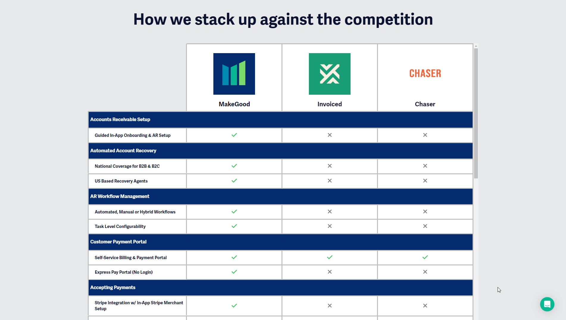
This table was created using the Comparison Table Generator.
6. SEMRUSH
Semrush is is an online platform used for keyword research and online ranking data, including metrics such as search volume and cost per click. They utilize a product comparison table to differentiate between their Free, Pro, and Guru pricing plans.
It includes the basic elements of a comparison table, including the products being compared as the column headers across the top of the table; the column headers containing the product name and a short description of the product, the features and attributes by which the products are being compared as the table body row headers (the first column), and indicator icons or text as the table data which signifies if an attribute is included in a corresponding product.
Unlike most comparison table designs, this one includes a label in the first table data cell in the first column that briefly explains what each product has to offer (“Nail the basics, deepen your strategy, or become a marketing guru”). This might be a little confusing to users because it breaks from the natural flow the rest of the comparison table, meaning you can’t decisively tell if it is a vertical column header since it is in the first row, or if it is a horizontal row header since it is in the first column.
