How to Design a User-Friendly Mega Menu - Squarespace 7.1
This mega menu was created using the Mega Menu Plugin for Squarespace 7.1.
A mega menu has become a staple UX element in many modern websites for good reason: it simplifies the user's navigation experience by displaying large, copious amounts of user choices in a segmented, more digestible way. However, there are conventions that should be followed to ensure optimal user-friendliness.
If you are considering adding a mega menu to your website, there are a few important things to consider when designing one that makes mega menus as user-friendly and accessible as possible for everyone.
Basic design patterns for mega menus
The Nielson Norman Group defines mega menus as “large, rectangular menus [that] group navigation options to eliminate scrolling and use typography, icons, and tooltips to explain users' choices.” Some important features of a mega menu outlined by the Nielson Norman Group are as follows:
Big, two-dimensional panels divided into groups of navigation options
Navigation choices are structured through layout, typography, and (sometimes) icons
Everything is visible at once — no scrolling
Menu options revealed on hover, click, or tap
What makes a mega menu design user-friendly?
When implemented the right way, a mega menu can add real value to your website’s navigation experience, but there are some conventional standards that need to be met before that can happen.
Logical Option Groupings
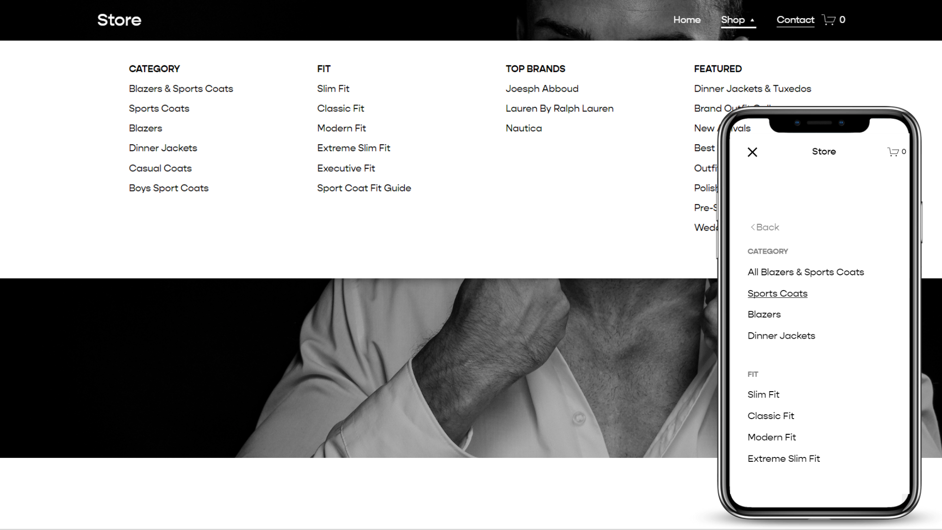
One of the most crucial elements of a usable and SEO-friendly mega menu is how menu options are grouped - both visually and content-wise. Option grouping refers to how the user choices are chunked into related sets. Let’s look at the mega menu for Squarespace’s “Products” menu item for an example of a user-friendly menu.
You’ll notice there are four groups, evenly spaced into four rows with all of the text left-aligned; this makes the mega menu easily scannable, meaning it’s easy for the user to look across the top row and find which group they should focus on, and look down the left side of each column.
You’ll also notice the choices are grouped into relevant sections as follows: Create a Website, Sell Anything, Build Your Brand, and Get a Domain. Each of these group titles describes each product in a concise, yet meaningful way so the user can immediately find which column they should be looking at.

A good example of a usable mega menu on Squarespace.com featuring 4 left-aligned columns chunked into scannable groupings.
Simplistic Design
The US Navy said it best: “Keep It Simple, Stupid.” When it comes to navigating a website, users are quick to abandon a complicated website. People’s lives are already busy enough - they don’t need the added stress of trying to figure out how to navigate your site. Let’s look at the following version of a mega menu from a Santa Cruz bike shop.

This mega menu design is too complicated for a user to navigate quickly because of inconsistent text alignment and imagery that is obstructing the flow of the navigation links.
Although the bike groupings make sense, there is no consistency in the text alignment with the left column being left-aligned and the right column being right-aligned. Not to mention, the two columns are on separate sides of an image that is very large, so the user’s eyes have to dart a considerably long distance to find what they need… But at least it looks cool, right? (wrong!) When implementing a mega menu on your Squarespace site, make sure you are not sacrificing user-friendliness for the sake of being abstract or extraordinary. The simplistic design is often the best way to go.
Full-Width Mega Menus vs. Smaller-Width Mega Menus
Depending on how much content your dropdown menus have, your site might be better suited for a full-width or a smaller-width menu.
If your menu content has a lot of links (more than 20) and any kind of medium to large size images, a full-width menu is probably best in this situation. This lets you utilize as much screen real-estate as possible so that there is adequate space for organizing menu content.
If your menu content has a small number of links (7-20), but you still need some sort of organization among menu content, a smaller-width menu might be best for you. This will let you organize links without having unnecessary blank space that occurs when a fill-width menu doesn’t have enough menu content.

An example of a full width mega menu using the Squarespace Mega Menu plugin.

An example of a shorter-width mega menu using the Squarespace Mega Menu V2 plugin.

Example of a smaller-width mega menu used by HubSpot.com. You can create a similar mega menu in Squarespace 7.1 using the Mega Menu V3 Plugin.
Mobile Menu Design
One of the biggest issues with mega menus is how to handle them on mobile devices. As you can imagine, this is a pretty crucial element to get just right, especially considering how important mobile-first design has become in recent years.
There are two main approaches to mobile mega menus:
The first way is the have links that open each nested child menu. This is not a very user-friendly design for mobile devices because after the first menu is opened, there is no real way of predicting how many times the user will need to keep opening nested menus until they find something they are looking for.
The second way is to only make the menu 2 levels. Each 1st-level menu item that opens a child menu will only open to a 2nd level, and the 2nd-level items will be segmented in a way that clearly segments each section. This way, there is an end in sight when the user opens the 1st-level menu. You can view some examples if this design below.

Yoast does a great job of segmenting sections in the mobile menu. The only change I would implement is making the section headings bolder and slightly larger than the sublinks, the separation of menu sections is clearer.

Here is an example showing a segmented mobile menu using the Mega Menu plugins from my plugin shop. The section headers are bold and slightly larger than the containing sub links so that the user knows how each menu section is separated.
Accessibility of Mega Menus
Even though properly organized mega menus can add a lot of value to a user’s experience, that’s not always the case for people who have disabilities.
Because mega menus are much larger in size and amount of content (as the name “mega” suggests), it can be annoying for keyboard navigators and mouse users to traverse them if accessibility is not taken into account. To ensure your Squarespace mega menu is inclusive to all users, it should be opened on click or should open and close on a .32s delay when opened via hover, and it should include appropriate Accessible Rich Internet Applications (ARIA) attributes that signify open and close functions to assistive technologies. To learn more about what makes a mega menu web-accessible, you might enjoy my article How to Make Your Squarespace Mega Menu Web-Accessible. It takes an in-depth analysis of all of the must-have features a keyboard-accessible mega menu should possess.


