7 CSS Snippets That Will Improve Your Squarespace 7.1 Navigation
Squarespace 7.1 provides some really great customization options for both desktop and mobile navigation, but there are still a few things that could be improved for a more user-friendly navigation. Here are 5 simple code snippets that will make both your desktop and mobile navigations more easily navigable.
1. Add a border to desktop dropdown menus
If your menu style is set to Dynamic, you might come across a page where the dropdown menu is the same color as the page. This makes the menu blend into the page and it’s not very obvious that a menu is open. With the below code snippet, you can add a border to all folder dropdown menus.

Dropdown menu is open, but it blends into the background.
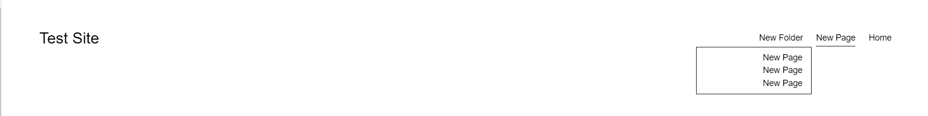
Adding a border the folder menu separates it from the background.
/* Start: Add border to dropdown */
.header-nav-folder-content {
  border: 1px solid #000000;
}
/* End: Add border to dropdown */
2. Add dropdown indicators to folder menus

By default, Squarespace folder menus do not include dropdown indicators for folder menus. This is not a great design because it breaks a very important rule of thoughtful design, which is affordance (this is a term coined by Don Norman, a pioneer in user experience design, and author of “Don Norman’s Design of Everyday Things”). Affordances represent the possibilities in the world for how a person can interact with something.
In terms of dropdown menus, a dropdown indicator lets the user know what result will come of interacting with the dropdown, which is that if the user hovers over the menu item, they will expect that a dropdown menu will open.
Use the below code snippet to add dropdown indicators to Squarepace 7.1 folder menus.
/* Start: Add dropdown indicator */
.header-nav-folder-title:after {
  content: "\25be";
  display: inline-block;
  margin-left: 2px;
}
/* End: Add dropdown indicator */3. Add a hover effect to navigation menu items
Currently, there is no way for you to add hover effects to Squarespace menu items. Here are 2 simple ways to add different hover affects (choose one, or use both):
Option 1. Add underline to menu items on mouse over

/* Start: Navigation underline hover affect */
.header-nav-item > a, .header-nav-folder-item-content {
  position: relative;
  z-index: 0;
  background-image: linear-gradient(currentColor,currentColor);
  background-repeat: repeat-x;
  background-size: 0px 0px;
  background-position: 0 100%;
  background-position: 0 calc(99.9%);
}
.header-nav-item:hover > a, .header-nav-folder-item:hover .header-nav-folder-item-content {
  background-size: 3px 3px !important;
}
/* End: Navigation underline hover affect */
Option 2. Add a background color to menu items (you can modify the background color and the text color in the below snippet)

/* Start: Navigation background hover affect */
.header-nav-item, .header-nav-folder-item {
  padding-left: 5px;
  padding-right: 5px;
}
.header-nav-item:hover, .header-nav-folder-item:hover {
  background: black;
}
.header-nav-item:hover > a, .header-nav-folder-item:hover span, .header-nav-item.header-nav-item--active:hover > a {
  color: #ffffff;
}
.header-nav .header-nav-item--folder .header-nav-folder-content {
  padding: 0;
}
.header .header-nav-wrapper .header-nav-folder-content a {
  padding: 10px;
}
/* End: Navigation background hover affect */
4. Replace mobile menu hamburger icon with text (this snippet includes customizable variables that you can modify)
Replacing the mobile menu icon with text makes it clear to the user where the mobile menu is and how to open it.

/* Replace mobile menu icon with text */
//Variables
@mobileMenuLabel__Background: black;
@mobileMenuLabel__FontColor: white;
@mobileMenuLabel__MenuLabel: "Menu";
@mobileMenuLabel__OpenMenuLabel: "Close";

button:not(.burger--active) .burger-box:after {
  content: @mobileMenuLabel__MenuLabel;
  background: @mobileMenuLabel__Background;
  padding: 8px;
  border-radius: 6px;
  color: @mobileMenuLabel__FontColor;
}
button.burger--active .burger-box:after {
  content: @mobileMenuLabel__OpenMenuLabel;
  background: @mobileMenuLabel__Background;
  padding: 8px;
  border-radius: 6px;
  color: @mobileMenuLabel__FontColor;
}
.burger-inner {
  display: none;
}
/* Replace mobile menu icon with text */
5. Add a .35 second delay to opening desktop folder menus on mouse over

Adding a short delay to opening the folder menus when hovered over ensures the user actually intended for the menu to open, instead of the menu opening when the user may not have meant for it to open.
/* Start: Folder menu delay */
@transitionDelay: .32s;

body:not(.sqs-edit-mode-active) .header-nav-item--folder .header-nav-folder-content {
  transition: opacity 0s linear @transitionDelay,visibility 0s linear @transitionDelay,z-index 0s linear @transitionDelay,max-height 0s linear @transitionDelay,max-width 0s linear @transitionDelay;
  -moz-transition: opacity 0s linear @transitionDelay,visibility 0s linear @transitionDelay,z-index 0s linear @transitionDelay,max-height 0s linear @transitionDelay,max-width 0s linear @transitionDelay;
  -webkit-transition: opacity 0s linear @transitionDelay,visibility 0s linear @transitionDelay,z-index 0s linear @transitionDelay,max-height 0s linear @transitionDelay,max-width 0s linear @transitionDelay;
  visibility: hidden;
  pointer-events: all;
}
body:not(.sqs-edit-mode-active) .header-nav-item--folder:hover .header-nav-folder-content {
  transition: opacity .1s linear @transitionDelay,visibility .1s linear @transitionDelay,z-index .1s linear @transitionDelay,max-height 0s linear @transitionDelay,max-width 0s linear @transitionDelay !important;
  -webkit-transition: opacity .1s linear @transitionDelay,visibility .1s linear @transitionDelay,z-index .1s linear @transitionDelay,max-height 0s linear @transitionDelay,max-width 0s linear @transitionDelay !important;
  -moz-transition: opacity .1s linear @transitionDelay,visibility .1s linear @transitionDelay,z-index .1s linear @transitionDelay,max-height 0s linear @transitionDelay,max-width 0s linear @transitionDelay !important;
  z-index: 10;
  visibility: visible;
}
/* End: Folder menu delay */6. Add vertical space between menu items when the menu wraps on smaller device widths
If your main navigation has more than 5 menu items, there is a good chance that it will wrap to a second line on smaller devices, mainly tablet devices. Because there is no vertical spacing when this happens, the menu items are kind of close together and it can be hard to touch the target menu item with a finger. This code snippet will add 15px of vertical spacing between menu items when they wrap to a second line.

No vertical padding on smaller devices means a smaller touch area (the user would struggle selecting one menu item because of the small touch area).

Added vertical padding on smaller devices makes a larger touch area (the user would have an easier time selecting one menu item because of the larger touch area).
/* Start: Add vertical spacing to desktop menu items */
.header-nav-list {
    grid-gap: 15px 0;
}
/* End: Add vertical spacing to desktop menu items */
Access 100+ CSS Code Snippets for Squarespace 7.1
If you want a complete CSS selector guide that has in-depth tutorials and code snippets for the Squarespace 7.1 platform, check out The Squarespace 7.1 CSS Selector Cheat Sheet Guide, which includes 2,000+ CSS selectors and in-depth explanations, as well as 100+ CSS code snippets for each Squarespace element in the 7.1 platform.
How the Guide is Organized
As you can see in the below image, this is more than just a cheat sheet. This complete guide includes CSS selector explanations for each Squarespace element that are neatly categorized into their own pages.
Once you select an element to examine, you will be presented with the different CSS selectors relevant to the element as well as explanations about how to use the selector(s).
More complex Squarespace elements - like the mobile and desktop header elements in the below image - include a segmented table so that you won’t be overwhelmed with the explanations.

Plugins for Adding Larger-Scale Customizations to Your Navigation Menu
If you are looking for a larger-scale solution for optimizing menu content, you can explore my collection of Squarespace 7.1 Mega Menu Plugins. All of them are different and achieve different things depending on what your needs are.


