How to Make Product Comparison Tables Web-Accessible

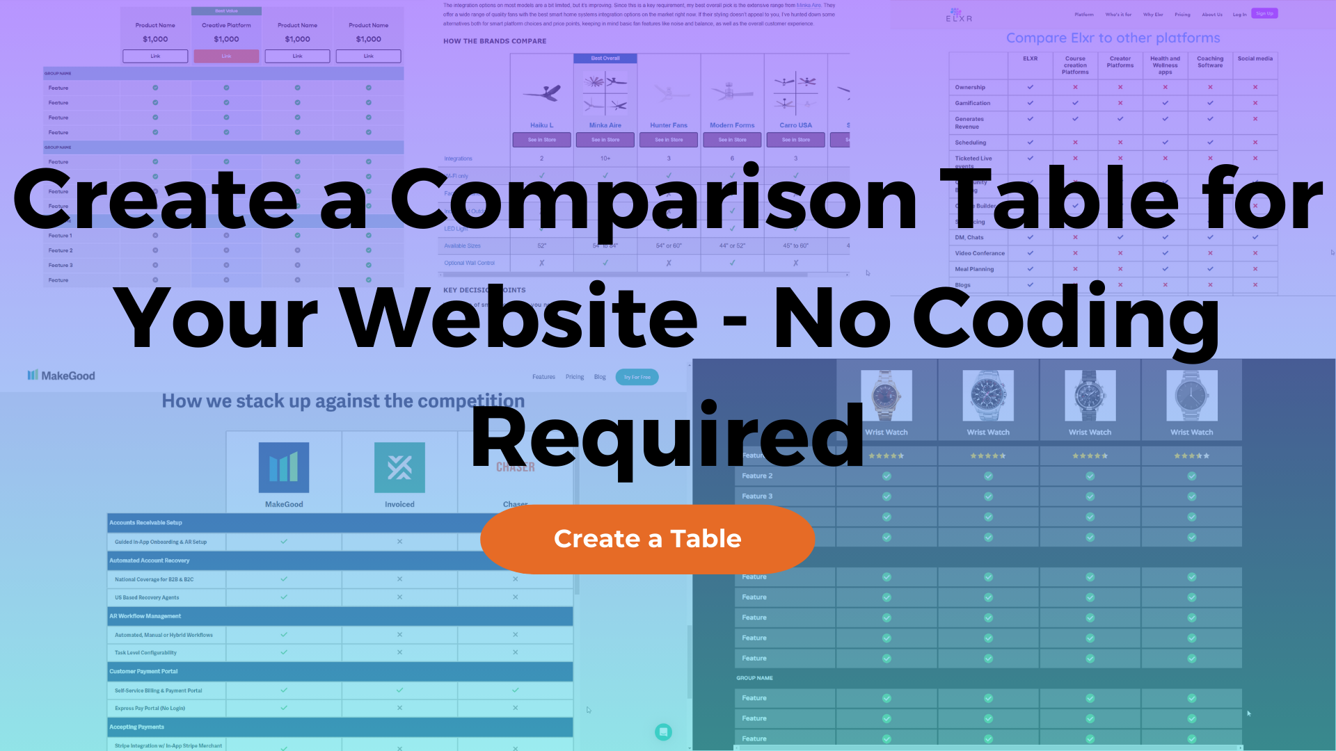
This table was created using the Comparison Table Generator.
Comparison tables have proven to be a timeless way of easily comparing a small number of offerings without causing cognitive load, which is a fancy way of saying users won’t have to do too much work just to understand what they are looking at. That’s being said, they are not always understandable by sight-impaired people who may use assistive technology to read web pages; that is because there is a right and a wrong way to structure comparison tables so that everyone can understand what they represent.
You can ensure your comparison table is web-accessible by using appropriate HTML table elements, including a table “caption” element that accurately describes the comparison table, and adding descriptive “title” attributes for decorative icons such as checkmarks and Xmarks. This will allow people who utilize assistive technologies to better understand the data in the table. In this article, we will go in-depth about what specific features your comparison table must have to be ADA-compliant on both desktop and mobile devices, and I will show you how you can create a completely web-accessible comparison table using the Comparison Table Generator.
Why is comparison table accessibility important?
A comparison table is a versatile tool that gives your site visitors a simple way of comparing different items or services without overwhelming them with too much information. It typically has the products or services being compared as table columns, and the attributes and inclusion/exclusion icons or text in the table body rows.
Even though comparison tables can be simple to understand for sighted users, they are not always as easy for people with sight impairments to read; this is mostly due to the fact that comparison tables fall under the class of “irregular tables,” which just means they do not match the structure of a basic data table. Because they are so irregular, many web developers and designers have not been trained in the proper HTML structure for tables of this nature. Even I will admit that when I first began my front-end development career in the corporate workforce, I came in with very little knowledge about web accessibility because its importance was not made a priority. But as it always has and will continue to do, times are changing.
The initiative to make the online world more inclusive is growing, and so are the consequences for not following suit. Many large and small companies have been threatened and involved in lawsuits over non-accessible web applications and websites. In 2020, there were over 2,500 ADA Title III website accessibility lawsuits filed in federal courts (Seyfarth) which is an astonishing 189% increase from the 3 years prior in 2017.
How to format an accessible table
The <table> element
The table element allows developers to arrange data into preformatted rows and columns. This is one of the most crucial aspects of a web-accessible comparison table because when assistive technologies such as screen readers recognize the <table> element, it will notify the user that they are currently navigating through some sort of arranged data, and it also allows for every containing element to be accurately relayed to the user.
All of the elements that we will talk about in the following sections will be children or descendants of the <table> element, including table rows <tr> and table data cells <td>. The important thing to remember going forward is that when the <table> element is omitted from a perceived data table, screen readers have no way of knowing what the context of the data is, so this is an essential element to include.
Table head elements
Table head <thead>
A table head notated as <thead> defines a set of rows that define the head of table columns. In most modern browsers, this element will be automatically inserted into the correct place.
Table row <tr>
The table row element is an important feature of a comparison table. When screen readers recognize this element, which is notated by <tr>, they can read the row count out to the user so that they know what point they are at in the table. It’s also important because the elements we will talk about in the following sections must be contained within a table row in order to be formatted correctly and to be accessible to the user.

This comparison table was made with the Comparison table generator.
Table header cell <th> with scope=“col”
Another crucial element is the <th> element, which represents a header cell. This element must be contained within a table row <tr> element.
An equally important aspect that the table header cell element needs to have is the “scope=’col’” attribute <th scope=‘col’>. The scope attribute signifies to screen readers how it should associate table data and table headers. This attribute combined with the table header cell element allows the screen reader to relay accurate table data context by reading which column a data cell belongs to, and neglecting to include this in your table design makes for a bad user experience for people with disabilities.
Think about how a person with no sight impairments may perceive the comparison table head in the below image: typically they would see the rows across the top that include the important data such as a product or service name, price, and a link. Automatically, they can tell that this information provides important context for the containing information below just by how the table looks. A person who has sight impairments, however, does not have the ability to perceive table data in this way, so they must rely completely on the device.

This comparison table was made with the Comparison table generator.
Table body elements
Table body <tbody>
A table body notated as <tbody> defines a set of rows that define the body of a table. In most modern browsers, this element will be automatically inserted into the correct place.
Table row <tr>
The table row element in the table body is just as important as in the table header for similar reasons. When screen readers recognize this element, which is notated by <tr>, they can read the row count out to the user so that they know what point they are at in the table, and the other elements we will discuss after this one are required to be inside of a table row.

This comparison table was made with the Comparison table generator.
Table header cell <th> with scope=“row”
Similar to how we included a table header element with scope=’col’ attribute in the table head, we need to do the same thing with the table row headers, except this time we’ll change “scope=’col’” to “scope=’row’”.
The scope attribute signifies to screen readers how it should associate table data and row headers. This attribute combined with the table header cell element allows the screen reader to relay accurate table data context by reading which row a data cell belongs to and neglecting to include this can cause confusion among people who use assistive technology.

This comparison table was made with the Comparison table generator.
Table data cell <td>
A table data cell specifies the content of the cell. Specifically in comparison tables, common table data cell content includes checkmark or x-mark icons that indicate whether or not an attribute is included in a product or service or just text.
Here is where most people make the biggest accessibility mistake; they don’t include “title” attributes for the icons that appear in table data cells. Font Awesome icons and Unicode symbols that have semantic meaning may be evident to people without sight impairments; for example, a person with sight can clearly derive meaning from the checkmark in the data cell. Because screen readers cannot translate the meaning of an icon, screen reader users cannot understand what they mean - it’s essentially like presenting an empty data cell. The “title” attribute can solve this issue by providing extra information that screen readers have access to. For instance, you can add a title attribute to all checkmarks that says “This feature is included,” which is what the screen reader will read to the user.

This comparison table was made with the Comparison table generator.
Basic web-accessible table code (not the final code snippet)
<table>
   <caption>
      This is a descriptive table caption.
   </caption>
   <thead>
      <tr>
         <th id="blank"></th>
         <th scope="col">Table header cell</th>
         <th scope="col">Table header cell</th>
         <th scope="col">Table header cell</th>
         <th scope="col">Table header cell</th>
      </tr>
   </thead>
   <tbody>
      <tr>
         <th scope="row">Feature Name</th>
         <td>
            <span title="Feature is included" class="featureCheck">✔</span>
         </td>
         <td>
            <span title="Feature is included" class="featureCheck">✔</span>
         </td>
         <td>
            <span>Data cell text</span>
         </td>
         <td>
            <span>Data cell text</span>
         </td>
      </tr>
   </tbody>
</table>
How to make the comparison table mobile-friendly with web-accessible features
Making comparison tables mobile-friendly for both able-bodied and differently-abled people can get kind of tricky, but luckily it is not impossible to satisfy both needs. Let’s take a look at how one slight change in the table structure can create a responsive, yet still web-accessible table.
Change feature row headers to column groups
By hiding the table header cells that act as row headers and adding a special kind of table header cell called a column group right above each content row that will only show on mobile devices, the previous desktop table layout turns into a mobile layout that is optimized for vertical scrolling.
A column group specifies a group of columns in a table. You should specify this using the scope=”colgroup” attribute, and you should also specify the number of columns that it spans using the “colspan” attribute. Note that because the feature row headers will be hidden on mobile devices with this solution, the “colspan” attribute needs to be the number of data cells not including the feature row headers. Correctly using both of these attributes will ensure assistive technology devices can recognize which table data content is a part of which column groups.

This comparison table was made with the Comparison table generator.
The final accessible and mobile-friendly table
This is the result of the web-accessible and mobile-friendly table features discussed in this article. It also includes some basic CSS that makes it look a little prettier and makes the table headers sticky when vertically and horizontally scrolled (if you are interested in the details behind making table headers sticky in a scrollable container, you might enjoy my article Sticky Table Headers with Vertical and Horizontal Scrollbars).
If you would rather not deal with the grimy details of the code, check out the free trial of the Comparison Table Generator to create a customized table without having to write any code.
<div class="tableContainer">
   <table>
      <caption>
         This is a descriptive table caption.
      </caption>
      <thead>
         <tr>
            <th class="emptyCell" title="Empty cell"></th>
            <th scope="col">Table header cell</th>
            <th scope="col">Table header cell</th>
            <th scope="col">Table header cell</th>
            <th scope="col">Table header cell</th>
         </tr>
      </thead>
      <tbody>
         <!-- Start: This is the mobile view column group -->
         <tr class="mobileColumnGroup">
            <th scope="colgroup" colspan="4"><span>Mobile column group</span></th>
         </tr>
         <!-- End: This is the mobile view column group -->
         <tr>
            <th scope="row" class="rowHeader">Desktop row header 1</th>
            <td>Table data cell</td>
            <td>
               <span title="Feature is included" class="featureCheck">✔</span>
            </td>
            <td>Table data cell</td>
            <td>
               <span title="Feature is not included" class="featureX">✘</span>
            </td>
         </tr>

         <!-- Start: This is the mobile view column group -->
         <tr class="mobileColumnGroup">
            <th scope="colgroup" colspan="4"><span>Mobile column group</span></th>
         </tr>
         <!-- End: This is the mobile view column group -->
         <tr>
            <th scope="row" class="rowHeader">Desktop row header 2</th>
            <td>Table data cell</td>
            <td>
               <span title="Feature is included" class="featureCheck">✔</span>
            </td>
            <td>Table data cell</td>
            <td>
               <span title="Feature is not included" class="featureX">✘</span>
            </td>
         </tr>

         <!-- Start: This is the mobile view column group -->
         <tr class="mobileColumnGroup">
            <th scope="colgroup" colspan="4"><span>Mobile column group</span></th>
         </tr>
         <!-- End: This is the mobile view column group -->
         <tr>
            <th scope="row" class="rowHeader">Desktop row header 3</th>
            <td>Table data cell</td>
            <td>
               <span title="Feature is included" class="featureCheck">✔</span>
            </td>
            <td>Table data cell</td>
            <td>
               <span title="Feature is not included" class="featureX">✘</span>
            </td>
         </tr>

         <!-- Start: This is the mobile view column group -->
         <tr class="mobileColumnGroup">
            <th scope="colgroup" colspan="4"><span>Mobile column group</span></th>
         </tr>
         <!-- End: This is the mobile view column group -->
         <tr>
            <th scope="row" class="rowHeader">Desktop row header 4</th>
            <td>Table data cell</td>
            <td>
               <span title="Feature is included" class="featureCheck">✔</span>
            </td>
            <td>Table data cell</td>
            <td>
               <span title="Feature is not included" class="featureX">✘</span>
            </td>
         </tr>
      </tbody>
   </table>
</div>

<style>
 @media(min-width: 769px) {
     .mobileColumnGroup {
         display: none;
    }
}
 @media(max-width: 769px) {
     .rowHeader, .emptyCell {
         display: none;
    }
}
 .tableContainer {
     overflow: auto;
     max-height: 500px;
}
 thead tr {
     position: sticky;
     top: 0;
     left: 0;
     z-index: 999;
}
 .rowHeader, [scope="colgroup"] span {
     left: 0;
     position: sticky;
}
 table {
     font-family: arial, sans-serif;
     border-collapse: collapse;
     width: 100%;
}
 td, th {
     border: 1px solid #dddddd;
     text-align: left;
     padding: 8px;
     min-width: 100px;
     background: #ffffff;
}
.featureCheck {
  color: green;
}
.featureX {
  color: red;
}
</style>
Want to create your very own comparison table that includes all of these web-accessible features complete with a mobile-friendly display and extra customization options? Check out the Comparison Table Generator that lets you easily customize table elements and data without having to write any code.
|
Best Value |
|||
|---|---|---|---|
| Basic Functionality | |||
| eCommerce | |||
| eCommerce | |||
| Blog Pages | |||
| Blog Pages | |||
| Create Visible & Hidden Pages | |||
| Create Visible & Hidden Pages | |||
| Create Password-Protected Pages | |||
| Create Password-Protected Pages | 10 limit | 60 limit | |
| Customize Font | |||
| Customize Font | |||
| Page Section Background Colors | |||
| Page Section Background Colors | |||
| Image Editing | |||
| Image Editing | |||
| Various Image Gallery Blocks | |||
| Various Image Gallery Blocks | |||
| Custom Code | |||
| Custom CSS, HTML, & JavaScript | |||
| Custom CSS, HTML, & JavaScript | |||
| Plugins & Add-Ons | |||
| Plugins & Add-Ons | |||
| Page Editing | |||
| Drag-and-Drop Editor (Unstructured) | |||
| Drag-and-Drop Editor (Unstructured) | |||
| Classic Editor (Structured) | |||
| Classic Editor (Structured) | |||
| Choose b/t structured or unstructured editor for individual page sections | |||
| Choose b/t structured or unstructured editor for individual page sections | |||