How to Create a Responsive Comparison Table w/ HTML & CSS
This table was created using the Comparison Table Generator.
Product comparison tables are optimal for allowing users to compare the pros and cons of services, offerings, or products. However, because of their irregularity compared to regular tables, it can be difficult to create comparison tables that look good, are responsive, and are web-accessible with pure HTML and CSS.
In this article, I’ll be explaining every aspect of a web-accessible and responsive comparison table using HTML and CSS and I’ll show you how easy it is to create a simple, comprehensive comparison table without touching code using the Comparison Table Generator.
What is a comparison table?
A comparison table is a versatile tool that provides users with a comprehensive way of comparing different items or services with low interaction cost and low cognitive load. It typically has the products or services being compared as table columns, and the attributes included in each product or service as the table rows. This has proven to be a timeless way of easily comparing a small number of offerings in web design.
Creating the Basic HTML structure
<table>
The table, notated as <table>, is the most basic part of a comparison table; it signifies to screen readers that this is a collection of formatted data that should be interpreted in a certain way, and it also includes some pre-formatted CSS stying which saves us some extra work.
All of the following HTML elements will be contained within the <table element>.
<thead>
The table head, notated as <thead>, signifies the table head. Within the head is a <tr> element (table row), which then contains <th> elements (table head) signifying the column headers. You can place almost any data you want inside of the <th> elements, including text, links, images, buttons, etc.
Generally in a comparison table, the first <th> element will be a blank cell that is just used to keep the table formatting lined up.

This table was created using the Comparison Table Generator.
<tbody>
The table body, notated as <tbody>, will hold all of the table data. All children of the <tbody> element will be table rows <tr>.
Within the table body rows <tr>, there can be two types of elements: table head cells <th> and table data cells <td>.
The first element in each row needs to be a <th>. This represents the table row headers that typically contain the name of the feature or attribute by which each column header is being compared.
The elements after the first <th> will all be data cells <td>. The data cells are what signify to the user whether or not a certain attribute in the row headers is included in each of the products/plans/services in the column headers. They will typically include text or icon indicators in the form of check marks or x-marks.

This table was created using the Comparison Table Generator.
Making the comparison table web-accessible
All of the basic table HTML elements we’ve covered up until this point are part of what makes tables web-accessible, but comparison tables are slightly different from basic HTML tables which means they require a little more work to ensure assistive technologies can accurately translate table data to users.
Here is a list of HTML attributes that will ensure screen readers can accurately determine the table content as outlined by the W3C Web Accessibility Initiative (WAI):
Scope attributes for column headers (scope="col")
Add a scope= “col” attribute to all of the <th> elements in the table header. This ensures table data is correctly associated with the respective columns.

This table was created using the Comparison Table Generator.
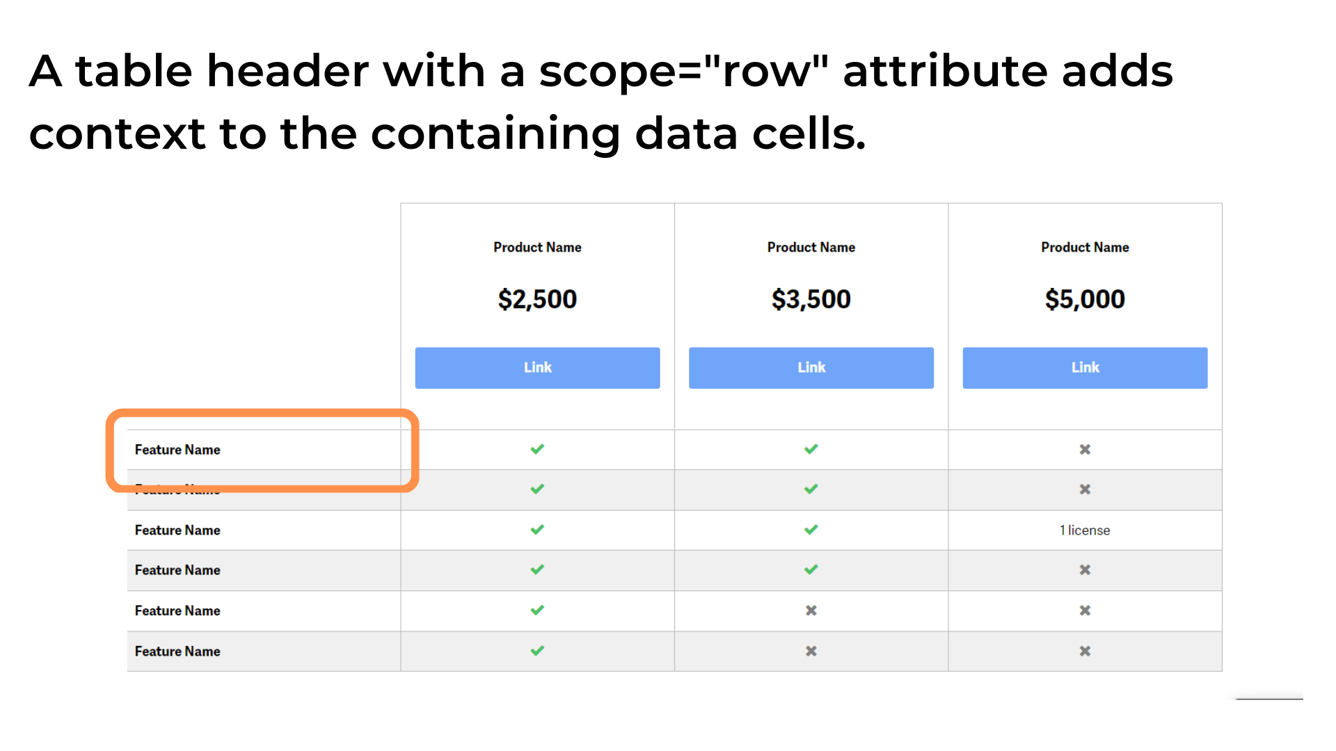
Scope attributes for row headers (scope="row")
Add a scope= “row” attribute to all of the <th> elements in the table body. This ensures table data is correctly associated with the respective row headers.
This table was created using the Comparison Table Generator.
Title attributes for icons
Comparison tables will often include icons indicating whether an item being compared includes a feature or not, usually a checkmark or an x-mark icon; however, icons that have semantic meaning like in this scenario aren’t always accessible for people who use screen readers.
To prevent issues like this from happening, you should add a “title” attribute to each icon that concisely describes the meaning of the icon. For example, “This feature is included” or “This feature is not included.” Neglecting to add descriptive “title” attributes will render as a blank data cell to screen readers, so this part is very important.

This table was created using the Comparison Table Generator.
Adding a table caption
Table captions are read out by screen readers to users so that they know what type of data is being displayed in the table before actually reading the table elements.
For a more in-depth analysis of how each of the above features makes comparison tables web-accessible, you might enjoy reading my article How to Make Comparison Tables Web-Accessible.
Here is a code example of the previously mentioned web-accessible attributes:
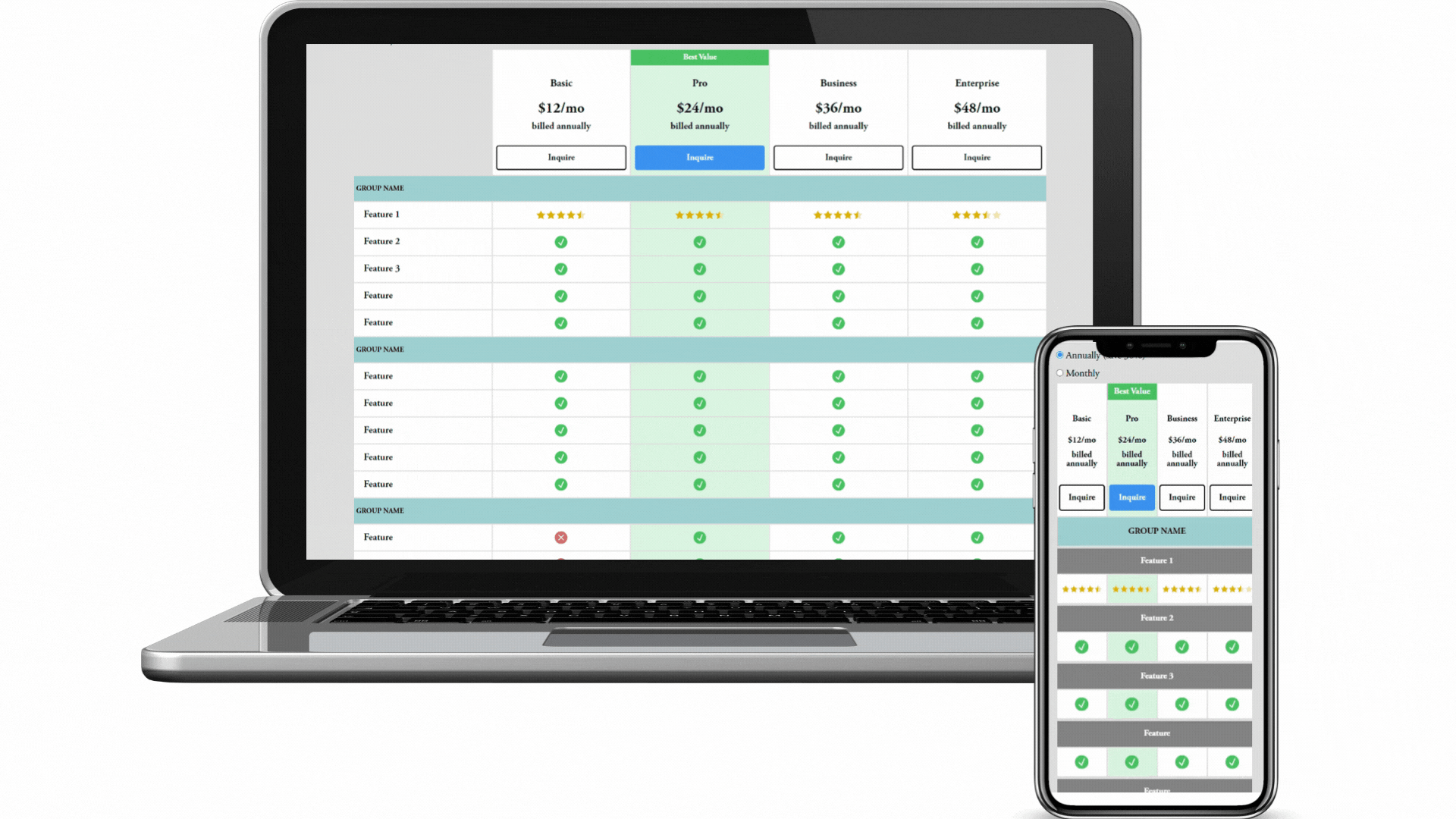
Making the comparison table responsive
There are a few different ways to make comparison tables mobile-friendly, some of which are better suited for small comparison tables, and some of which work better for larger data tables with a lot of columns. In terms of comparison tables for plans, products, or services that typically don’t have more than 4 columns, a great way to handle responsive views is to hide the feature rows on the left and add column groups for the data cells that will contain the same data as the feature row headers, optimizing the table for vertical scrolling on mobile devices.
Change feature row headers to column groups
By hiding the table header cells that act as row headers and adding a special kind of table header cell called a column group right above each content row that will only be visible on mobile devices, the previous desktop table layout turns into a mobile layout that is optimized for vertical scrolling.
A column group specifies a group of columns in a table. You should specify this using the scope=”colgroup” attribute, and you should also specify the number of columns that it spans using the “colspan” attribute. Note that because the feature row headers will be hidden on mobile devices with this solution, the “colspan” attribute needs to be the number of data cells not including the feature row headers. Correctly using both of these attributes will ensure assistive technology devices can recognize which table data content is a part of which column groups.

Creating sticky table headers on desktop and mobile
Making the table column and row headers sticky makes it possible for users to maintain the data cell context with minimal effort and cognitive load (see below examples); however, achieving this in a way that is responsive on all devices can be tricky. I’ve created a javascript solution that will ensure table headers are sticky no matter what the device size and it also works if a parent element of the table is set to “overflow:auto;” or “overflow:scroll;” which are common CSS properties that can break the position sticky of vertical column headers.

This table was created using the Comparison Table Generator.
Final HTML, CSS & JS table code: Responsive & web-accessible with sticky headers
Resulting Table
HTML
<div class="tableContainer">
  <table>
    <caption>
      This is a descriptive table caption.
    </caption>
    <thead>
      <tr class="columnHeaders">
        <th class="columnHeader emptyCell" title="Empty cell"></th>
        <th scope="col" class="columnHeader">Table header cell</th>
        <th scope="col" class="columnHeader">Table header cell</th>
        <th scope="col" class="columnHeader">Table header cell</th>
        <th scope="col" class="columnHeader">Table header cell</th>
      </tr>
    </thead>
    <tbody>
      <!-- Start: This is the mobile view column group -->
      <tr class="mobileColumnGroup">
        <th scope="colgroup" colspan="4"><span>Mobile column group 1</span></th>
      </tr>
      <!-- End: This is the mobile view column group -->
      <tr class="tableBodyRow">
        <th scope="row" class="rowHeader">Desktop row header 1</th>
        <td>Table data cell</td>
        <td>
          <span title="Feature is included" class="featureCheck">✔</span>
        </td>
        <td>Table data cell</td>
        <td>
          <span title="Feature is not included" class="featureX">✘</span>
        </td>
      </tr>
      <!-- Start: This is the mobile view column group -->
      <tr class="mobileColumnGroup">
        <th scope="colgroup" colspan="4"><span>Mobile column group 2</span></th>
      </tr>
      <!-- End: This is the mobile view column group -->
      <tr class="tableBodyRow">
        <th scope="row" class="rowHeader">Desktop row header 2</th>
        <td>Table data cell</td>
        <td>
          <span title="Feature is included" class="featureCheck">✔</span>
        </td>
        <td>Table data cell</td>
        <td>
          <span title="Feature is not included" class="featureX">✘</span>
        </td>
      </tr>
      <!-- Start: This is the mobile view column group -->
      <tr class="mobileColumnGroup">
        <th scope="colgroup" colspan="4"><span>Mobile column group 3</span></th>
      </tr>
      <!-- End: This is the mobile view column group -->
      <tr class="tableBodyRow">
        <th scope="row" class="rowHeader">Desktop row header 3</th>
        <td>Table data cell</td>
        <td>
          <span title="Feature is included" class="featureCheck">✔</span>
        </td>
        <td>Table data cell</td>
        <td>
          <span title="Feature is not included" class="featureX">✘</span>
        </td>
      </tr>
      <!-- Start: This is the mobile view column group -->
      <tr class="mobileColumnGroup">
        <th scope="colgroup" colspan="4"><span>Mobile column group 4</span></th>
      </tr>
      <!-- End: This is the mobile view column group -->
      <tr class="tableBodyRow">
        <th scope="row" class="rowHeader">Desktop row header 4</th>
        <td>Table data cell</td>
        <td>
          <span title="Feature is included" class="featureCheck">✔</span>
        </td>
        <td>Table data cell</td>
        <td>
          <span title="Feature is not included" class="featureX">✘</span>
        </td>
      </tr>
      <!-- Start: This is the mobile view column group -->
      <tr class="mobileColumnGroup">
        <th scope="colgroup" colspan="4"><span>Mobile column group 5</span></th>
      </tr>
      <!-- End: This is the mobile view column group -->
      <tr class="tableBodyRow">
        <th scope="row" class="rowHeader">Desktop row header 5</th>
        <td>Table data cell</td>
        <td>
          <span title="Feature is included" class="featureCheck">✔</span>
        </td>
        <td>Table data cell</td>
        <td>
          <span title="Feature is not included" class="featureX">✘</span>
        </td>
      </tr>
      <!-- Start: This is the mobile view column group -->
      <tr class="mobileColumnGroup">
        <th scope="colgroup" colspan="4"><span>Mobile column group 6</span></th>
      </tr>
      <!-- End: This is the mobile view column group -->
      <tr class="tableBodyRow">
        <th scope="row" class="rowHeader">Desktop row header 6</th>
        <td>Table data cell</td>
        <td>
          <span title="Feature is included" class="featureCheck">✔</span>
        </td>
        <td>Table data cell</td>
        <td>
          <span title="Feature is not included" class="featureX">✘</span>
        </td>
      </tr>
      <!-- Start: This is the mobile view column group -->
      <tr class="mobileColumnGroup">
        <th scope="colgroup" colspan="4"><span>Mobile column group 7</span></th>
      </tr>
      <!-- End: This is the mobile view column group -->
      <tr class="tableBodyRow">
        <th scope="row" class="rowHeader">Desktop row header 7</th>
        <td>Table data cell</td>
        <td>
          <span title="Feature is included" class="featureCheck">✔</span>
        </td>
        <td>Table data cell</td>
        <td>
          <span title="Feature is not included" class="featureX">✘</span>
        </td>
      </tr>
      <!-- Start: This is the mobile view column group -->
      <tr class="mobileColumnGroup">
        <th scope="colgroup" colspan="4"><span>Mobile column group 8</span></th>
      </tr>
      <!-- End: This is the mobile view column group -->
      <tr class="tableBodyRow">
        <th scope="row" class="rowHeader">Desktop row header 8</th>
        <td>Table data cell</td>
        <td>
          <span title="Feature is included" class="featureCheck">✔</span>
        </td>
        <td>Table data cell</td>
        <td>
          <span title="Feature is not included" class="featureX">✘</span>
        </td>
      </tr>
      <!-- Start: This is the mobile view column group -->
      <tr class="mobileColumnGroup">
        <th scope="colgroup" colspan="4"><span>Mobile column group 9</span></th>
      </tr>
      <!-- End: This is the mobile view column group -->
      <tr class="tableBodyRow">
        <th scope="row" class="rowHeader">Desktop row header 9</th>
        <td>Table data cell</td>
        <td>
          <span title="Feature is included" class="featureCheck">✔</span>
        </td>
        <td>Table data cell</td>
        <td>
          <span title="Feature is not included" class="featureX">✘</span>
        </td>
      </tr>
      <!-- Start: This is the mobile view column group -->
      <tr class="mobileColumnGroup">
        <th scope="colgroup" colspan="4"><span>Mobile column group 10</span></th>
      </tr>
      <!-- End: This is the mobile view column group -->
      <tr class="tableBodyRow">
        <th scope="row" class="rowHeader">Desktop row header 10</th>
        <td>Table data cell</td>
        <td>
          <span title="Feature is included" class="featureCheck">✔</span>
        </td>
        <td>Table data cell</td>
        <td>
          <span title="Feature is not included" class="featureX">✘</span>
        </td>
      </tr>
      <!-- Start: This is the mobile view column group -->
      <tr class="mobileColumnGroup">
        <th scope="colgroup" colspan="4"><span>Mobile column group 11</span></th>
      </tr>
      <!-- End: This is the mobile view column group -->
      <tr class="tableBodyRow">
        <th scope="row" class="rowHeader">Desktop row header 11</th>
        <td>Table data cell</td>
        <td>
          <span title="Feature is included" class="featureCheck">✔</span>
        </td>
        <td>Table data cell</td>
        <td>
          <span title="Feature is not included" class="featureX">✘</span>
        </td>
      </tr>
      <!-- Start: This is the mobile view column group -->
      <tr class="mobileColumnGroup">
        <th scope="colgroup" colspan="4"><span>Mobile column group 12</span></th>
      </tr>
      <!-- End: This is the mobile view column group -->
      <tr class="tableBodyRow">
        <th scope="row" class="rowHeader">Desktop row header 12</th>
        <td>Table data cell</td>
        <td>
          <span title="Feature is included" class="featureCheck">✔</span>
        </td>
        <td>Table data cell</td>
        <td>
          <span title="Feature is not included" class="featureX">✘</span>
        </td>
      </tr>
      <!-- Start: This is the mobile view column group -->
      <tr class="mobileColumnGroup">
        <th scope="colgroup" colspan="4"><span>Mobile column group 13</span></th>
      </tr>
      <!-- End: This is the mobile view column group -->
      <tr class="tableBodyRow">
        <th scope="row" class="rowHeader">Desktop row header 13</th>
        <td>Table data cell</td>
        <td>
          <span title="Feature is included" class="featureCheck">✔</span>
        </td>
        <td>Table data cell</td>
        <td>
          <span title="Feature is not included" class="featureX">✘</span>
        </td>
      </tr>
      <!-- Start: This is the mobile view column group -->
      <tr class="mobileColumnGroup">
        <th scope="colgroup" colspan="4"><span>Mobile column group 14</span></th>
      </tr>
      <!-- End: This is the mobile view column group -->
      <tr class="tableBodyRow">
        <th scope="row" class="rowHeader">Desktop row header 14</th>
        <td>Table data cell</td>
        <td>
          <span title="Feature is included" class="featureCheck">✔</span>
        </td>
        <td>Table data cell</td>
        <td>
          <span title="Feature is not included" class="featureX">✘</span>
        </td>
      </tr>
      <!-- Start: This is the mobile view column group -->
      <tr class="mobileColumnGroup">
        <th scope="colgroup" colspan="4"><span>Mobile column group 15</span></th>
      </tr>
      <!-- End: This is the mobile view column group -->
      <tr class="tableBodyRow">
        <th scope="row" class="rowHeader">Desktop row header 15</th>
        <td>Table data cell</td>
        <td>
          <span title="Feature is included" class="featureCheck">✔</span>
        </td>
        <td>Table data cell</td>
        <td>
          <span title="Feature is not included" class="featureX">✘</span>
        </td>
      </tr>
      <!-- Start: This is the mobile view column group -->
      <tr class="mobileColumnGroup">
        <th scope="colgroup" colspan="4"><span>Mobile column group 16</span></th>
      </tr>
      <!-- End: This is the mobile view column group -->
      <tr class="tableBodyRow">
        <th scope="row" class="rowHeader">Desktop row header 16</th>
        <td>Table data cell</td>
        <td>
          <span title="Feature is included" class="featureCheck">✔</span>
        </td>
        <td>Table data cell</td>
        <td>
          <span title="Feature is not included" class="featureX">✘</span>
        </td>
      </tr>
      <!-- Start: This is the mobile view column group -->
      <tr class="mobileColumnGroup">
        <th scope="colgroup" colspan="4"><span>Mobile column group 17</span></th>
      </tr>
      <!-- End: This is the mobile view column group -->
      <tr class="tableBodyRow">
        <th scope="row" class="rowHeader">Desktop row header 17</th>
        <td>Table data cell</td>
        <td>
          <span title="Feature is included" class="featureCheck">✔</span>
        </td>
        <td>Table data cell</td>
        <td>
          <span title="Feature is not included" class="featureX">✘</span>
        </td>
      </tr>
      <!-- Start: This is the mobile view column group -->
      <tr class="mobileColumnGroup">
        <th scope="colgroup" colspan="4"><span>Mobile column group 18</span></th>
      </tr>
      <!-- End: This is the mobile view column group -->
      <tr class="tableBodyRow">
        <th scope="row" class="rowHeader">Desktop row header 18</th>
        <td>Table data cell</td>
        <td>
          <span title="Feature is included" class="featureCheck">✔</span>
        </td>
        <td>Table data cell</td>
        <td>
          <span title="Feature is not included" class="featureX">✘</span>
        </td>
      </tr>
      <!-- Start: This is the mobile view column group -->
      <tr class="mobileColumnGroup">
        <th scope="colgroup" colspan="4"><span>Mobile column group 19</span></th>
      </tr>
      <!-- End: This is the mobile view column group -->
      <tr class="tableBodyRow">
        <th scope="row" class="rowHeader">Desktop row header 19</th>
        <td>Table data cell</td>
        <td>
          <span title="Feature is included" class="featureCheck">✔</span>
        </td>
        <td>Table data cell</td>
        <td>
          <span title="Feature is not included" class="featureX">✘</span>
        </td>
      </tr>
      <!-- Start: This is the mobile view column group -->
      <tr class="mobileColumnGroup">
        <th scope="colgroup" colspan="4"><span>Mobile column group 20</span></th>
      </tr>
      <!-- End: This is the mobile view column group -->
      <tr class="tableBodyRow">
        <th scope="row" class="rowHeader">Desktop row header 20</th>
        <td>Table data cell</td>
        <td>
          <span title="Feature is included" class="featureCheck">✔</span>
        </td>
        <td>Table data cell</td>
        <td>
          <span title="Feature is not included" class="featureX">✘</span>
        </td>
      </tr>
    </tbody>
  </table>
  <div class="horizontal-scroller">
    <div class="horizontal-scroller-content"></div>
  </div>
</div>
CSS
@media(min-width: 769px) {
  .mobileColumnGroup {
    display: none;
  }
}
@media(max-width: 769px) {
  .rowHeader, .emptyCell {
    display: none;
  }
}
.tableContainer {
  overflow: auto;
  overflow-anchor: none;
  position: relative;
}
.tableContainer caption {
  height: 0px;
}
thead tr {
  position: sticky;
  top: 0;
  left: 0;
  z-index: 999;
}
.rowHeader, [scope="colgroup"] span {
  left: 0;
  position: sticky;
}
table {
  font-family: arial, sans-serif;
  border-collapse: separate;
  border-spacing: 0;
  width: 100%;
  table-layout: auto;
}
td, th {
  border: 1px solid #dddddd;
  text-align: center;
  padding: 8px;
  min-width: 100px;
  max-width: 100px;
  background: #ffffff;
}
.mobileColumnGroup th {
    text-align: left;
}
.rowHeader {
  text-align: left;
}
.featureCheck {
  color: green;
}
.featureX {
  color: red;
}
thead.stickyHeader {
  position: fixed;
  z-index: 999;
  overflow-x: scroll;
  top: 0px;
}
thead.stickyHeader.atBottom {
  position: absolute;
  z-index: 999;
  bottom: 0px;
  left: 0px !important;
  top: initial;
  width: initial !important;
  overflow-x: clip;
}
thead::-webkit-scrollbar {
  height: 0px;
}
.horizontal-scroller {
  position: fixed;
  bottom: 0;
  height: 30px;
  overflow: auto;
  overflow-y: hidden;
}
.horizontal-scroller-content {
  height: 30px;
}
JavaScript
document.addEventListener("DOMContentLoaded", function() {
  try {
    var compTable = document.querySelector(".tableContainer");
    if (compTable) {
      var tableBodyRowData = compTable.querySelectorAll(".tableBodyRow td, .tableBodyRow th");
      var caption = compTable.querySelector("caption");
      var captionHeight = caption ? caption.offsetHeight : 0;
      var compTableBody = compTable.querySelector("tbody");
      var compTableHead = compTable.querySelector("thead");
      var columnHeaders = compTable.querySelectorAll(".columnHeader");
      var columnHeadersRow = compTableHead.querySelector(".columnHeaders");
      var columnHeadersNotEmpty = compTableHead.querySelectorAll(".columnHeader:not(.emptyCell)");
      var horizontalScroller = compTable.querySelector(".horizontal-scroller");
      var horizontalScrollerContent = horizontalScroller.querySelector(".horizontal-scroller-content");
      var originalTablePosition = "";

      function checkTableOffset() {
        var compTableRect = compTable.getBoundingClientRect();
        var compTableHeadRect = compTableHead.getBoundingClientRect();
        var compTableBodyRect = compTableBody.getBoundingClientRect();
        var compTableHeadRowRect = columnHeadersRow.getBoundingClientRect();
        horizontalScroller.style.left = compTableRect.left + "px";
        horizontalScroller.style.width = compTableRect.width + "px";
        horizontalScrollerContent.style.width = compTable.scrollWidth + "px";
        if (compTableRect.top <= 0 && compTableRect.height-50 > window.innerHeight) {
          calculateColumnHeaderWidthsAndPos(compTableRect, compTableHeadRect, compTableBodyRect);
        } else if (compTableBodyRect.top > compTableHeadRect.bottom) {
          resetTable();
        }

        if (compTableRect.bottom <= window.innerHeight || compTableRect.top > window.innerHeight) {
          horizontalScroller.style.visibility = "hidden";
        } else if (compTableRect.top <= window.innerHeight && compTable.clientWidth < compTable.scrollWidth) {
          horizontalScroller.style.visibility = "visible";
        }

        if (compTableRect.bottom <= compTableHeadRect.bottom && !Array.from(compTableHead.classList).includes("atBottom")) {
          compTableHead.classList.add("atBottom");
        } else if (compTableHeadRect.top >= 0) {
          compTableHead.classList.remove("atBottom");
        }
      }

      function scrollColumnHeader(compTable) {
        compTableHead.scrollLeft = compTable.scrollLeft;
      }

      function setColWidths(compTableRect) {
        compTableHead.style.width = compTableRect.width + "px";
        compTableHead.style.left = compTableRect.left + "px";
        for (let i = 0; i < columnHeaders.length; i++) {
          var tableBodyRowDataRect = tableBodyRowData[i].getBoundingClientRect();
          if (Array.from(compTableHead.classList).includes("stickyHeader")) {
            columnHeaders[i].style.minWidth = getComputedStyle(tableBodyRowData[i]).width;
          } else {
            columnHeaders[i].style.minWidth = "initial";
          }
        }
      }

      function calculateColumnHeaderWidthsAndPos(compTableRect, compTableHeadRect, compTableBodyRect) {
        compTableHead.classList.add("stickyHeader");
        scrollColumnHeader(compTable);
        setColWidths(compTableRect);

        var xMatrix = parseFloat(getComputedStyle(compTableBody).transform.substring(getComputedStyle(compTableBody).transform.indexOf("(")+1, getComputedStyle(compTableBody).transform.lastIndexOf(")")).split(",")[5]);
        if ((xMatrix == 0 || getComputedStyle(compTableBody).transform == 'none')) {
          compTableBody.style.transform = "translateY(" + (compTableHead.offsetHeight - captionHeight) + "px)";
          compTable.style.paddingBottom = (compTableHead.offsetHeight - captionHeight) + "px";
        }
      }

      function resetTable() {
        compTableHead.classList.remove("stickyHeader");
        compTableBody.style.transform = "translateY(0px)";
        compTable.style.paddingBottom = "0px";
      }

      window.addEventListener("scroll", function() {
        checkTableOffset();
      });

      window.addEventListener("resize", function () {
        resetTable();
        checkTableOffset();
      });

      compTable.addEventListener("scroll", function(e) {
        if (Array.from(compTableHead.classList).includes("stickyHeader") && !Array.from(compTableHead.classList).includes("atBottom")) {
          scrollColumnHeader(e.target);
        }
        horizontalScroller.scrollLeft = e.target.scrollLeft;
      });

      horizontalScroller.addEventListener("scroll", function(e) {
        if (Array.from(compTableHead.classList).includes("stickyHeader") && !Array.from(compTableHead.classList).includes("atBottom")) {
          scrollColumnHeader(e.target);
        }
        compTable.scrollLeft = e.target.scrollLeft;
      });

      compTableHead.addEventListener("scroll", function(e) {
        horizontalScroller.scrollLeft = e.target.scrollLeft;
        compTable.scrollLeft = e.target.scrollLeft;
      });

      var compTableRect = compTable.getBoundingClientRect();
      setColWidths(compTableRect);
      checkTableOffset();
    }
  } catch(error) {
    console.log(error);
  }
});
Real-Life Examples of Product Comparison Tables for Your Inspiration
If you want to see plenty of product comparison designs to inspire how your product comparison table should look, check out my article 40+ Modern Examples of Product Comparison Tables in Web Design where I outline more than 40 modern examples of product comparison tables that are being used by some of the most popular, successful brands and businesses.
Product & Pricing Comparison Table Generator - No Coding Required
The Premium Comparison Table Generator utilizes a user-friendly interface that lets you enter your own table data, and when you’re ready to use your table, the HTML and CSS code is auto-generated within seconds with just the click of a button, taking the tedious task of coding off your hands.
The premium version comes with lots of customization options including colors, an unlimited number of rows, and even the ability to segment related feature rows into groups. With one purchase, you get permanent access to the generator, as well as priority consideration for customization requests.
Customizable features include
Unlimited Rows
Customizable table colors
Optional column header fields including images, pricing text, and links
Product, plan, or other offering text in column headers
Attribute names as row headers
Inclusion/exclusion text or icon (checkmark or ‘x’) indicators
Including feature row groups

Source: The Nielson Norman Group