What Are the Pros and Cons of Comparison Tables?
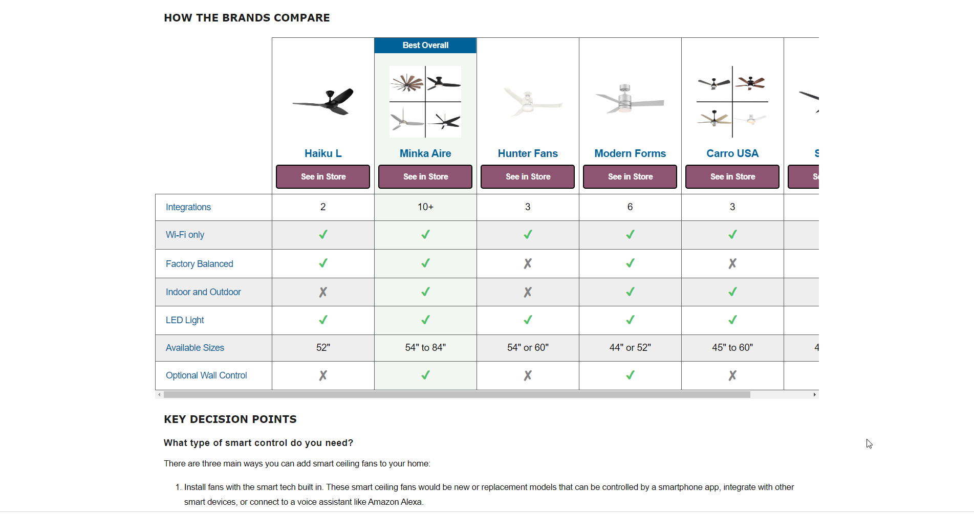
This table was created using the Comparison Table Generator.
What is a Comparison Table?
A comparison table is a tool used to compare a small number of different items or services in the columns, based on the attributes being compared in the row headers. The table data includes an indicator icon or text that signifies if the attribute is included in a corresponding offering. Comparison tables that are well-designed have proven to be the superior method for comparing products, plans, services, locations, and a multitude of other things.
Pros of Comparison Tables
Simplistic, comprehensive way of comparing things
The way that data is structured within comparison tables makes them very easy to understand more quickly than if the data was displayed in no organized fashion.
Typically the items being compared go across the top of the table in the column headers; the attributes by which the items are being compared are the row headers to the left of the table; the table data includes icons or text that indicate whether an item includes the respective attribute.
Effective lead conversion tool
Comparison is one of the most critical activities a user performs before performing a desired action. This means that a well-designed comparison table could mean the difference between a user clicking your CTA or bouncing from your site.
According to the Nielson Norman Group, An essential first step to enabling comparison is giving the user consistent information for all of the comparable products and/or services. However, when that crucial info is spread across multiple pages on your site, users are forced to remember information, take notes, flip between tabs, or open multiple browser windows. This is not an ideal situation for the user especially if you want to make it easy for them to take action on your site.
Comparison tables help lighten the cognitive load described in the previous explanation by organizing the data in a structured layout that is scannable. Some comparison tables even include CTAs in the column headers so that it is that much easier for the user to take a desired action.
Versatility - can be used in many different scenarios
One of the great things about comparison tables is how versatile they are. They can be used to compare locations, products, services, animals, competitors, pricing packages, hotel resorts, coffee machines, and so much more.
To see more than 40 examples of how versatile comparison tables are, check out my article 40+ Modern Examples of Product Comparison Tables in Web Design.
Cons of Comparison Tables
They can be difficult to code in HTML and CSS without an experienced developer
Comparison tables are a class of irregular tables because of the bi-directional table headers. This means they can be a bit more difficult to code than basic tables, especially if you have little experience in coding.
If you are interested in knowing what goes into coding a comparison table, check out my article How to Create a Responsive Product Comparison Table w/ HTML & CSS where you will learn how to code the HTML for a responsive and web-accessible comparison table.
If you would rather not deal with the grimy details of coding irregular tables, you might consider using the Comparison Table Generator, which allows you to create and customize multiple comparison tables without having to touch any code.
Comparison tables can be difficult to make work on mobile devices
The basic comparison table design is optimal for desktop devices, but the same layout that works on desktops is not all that great on mobile devices.
In the first picture below, you can see what the desktop layout looks like on a phone; most of the columns are cut off because the feature row headers take up a lot of the horizontal screen real estate, and the feature row header text is a lot less readable because of how condensed it is.
In the second picture below, you can see an altered view of the desktop layout that is more optimal for vertical scrolling on a mobile devices. This layout hides the feature row headers on the left, and turns them into column groups. Changing the layout in this way allows more of the columns to be on the screen at once, making the table more readable on smaller devices.
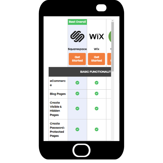
Desktop layout on mobile device. Not optimal for viewing on phones.
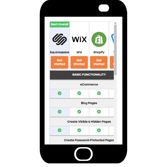
Altered mobile layout of the table. More optimal for viewing on phones. The Comparison Table Generator automatically creates this mobile view for you when you generate your own comparison tables.