What Should Be Included in a Product Comparison Table?
Every product comparison table is different and is used to accomplish different goals. There are some basic elements that every comparison table should include, and there are some elements that will work better for some comparison tables more than others.
In this article we will learn what those elements are and when you should include them in your product comparison table.
The Basic Elements
Each product comparison table will likely be different based on each table’s goal and context, but there are some basic elements that all product comparison table will have.
The basic elements that should be included in a product comparison table are as follows:
The products being compared as the column headers across the top of the table. The column headers should contain at least the product name, but they can additionally include images, buttons, price, and more.
The features and attributes by which the products are being compared as the table body row headers
Indicator icons or text as the table data which signifies if an attribute is included in a corresponding product
If you want an in-depth tutorial on how to create a responsive and web-accessible product comparison table with HTML and CSS, you might enjoy reading my blog post How to Create a Responsive Product Comparison Table w/ HTML & CSS. If you’re not a developer or just don’t want to deal with the grimy details of code, check out the Free Comparison Table Generator, which allows you to create as many comparison tables as you want without requiring knowledge of code.
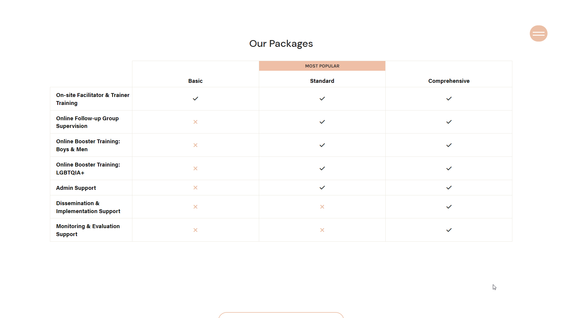
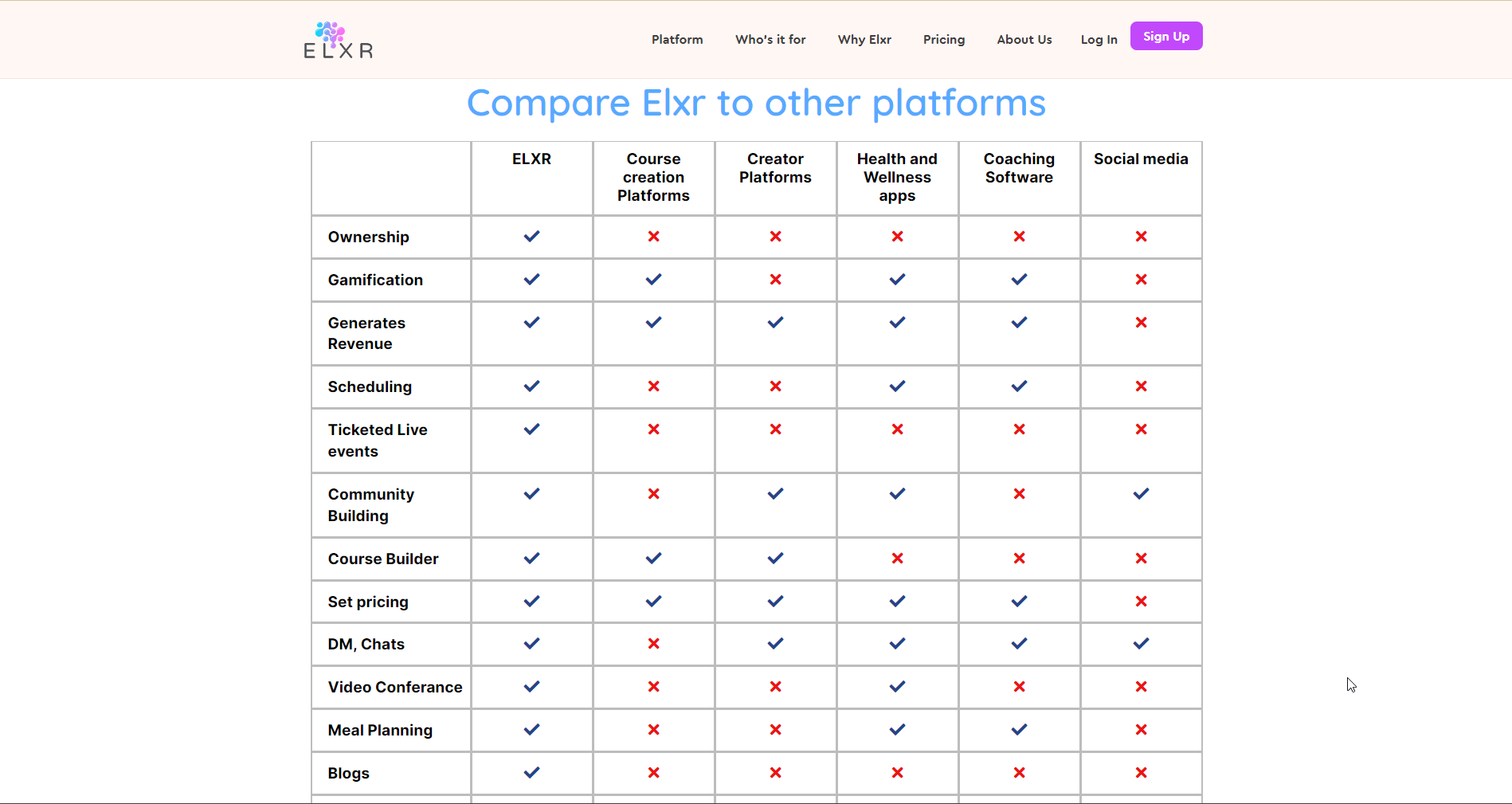
This table was created using the Comparison Table Generator. It includes all of the basic elements that a product comparison table should have.
This table was created using the Comparison Table Generator.
Additional Elements to Optimize Comparison Tables
Now that we know the basic elements of product comparison tables, let’s analyze some extra elements that can really optimize your table and convert more users into customers.
Highlighted Product
Product comparison tables can be used to differentiate one’s product from competitors. In cases like this, you might want to visually highlight the best product so that it’s clear to the user which product is the best option.
To highlight a certain product, you can make the respective column a slightly brighter color than the others and you can add a label at the top that states how that product is better than the others.
Feature Row Groups
Some product comparison tables can be pretty long (30+ rows). Adding feature row groups is an easy way to segment the table rows into categories that make the table more readable and less overwhelming for the user.
This table was created using the Comparison Table Generator. In addition to the basic elements of a comparison table, it highlights the product column that is labeled “Best Overall” to differentiate it from the other products.
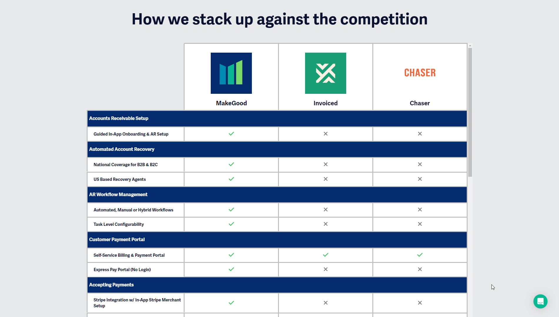
This table was created using the Comparison Table Generator. In addition to the basic elements of a comparison table, it highlights the product column that is labeled “More customizable” to differentiate it from the other products, and it also includes feature row groups to segment the attributes being compared.
This table was created using the Comparison Table Generator. It includes feature row groups in the table body that categorize the different attributes for a more comprehensive table.


